Behind the scenesThree words on one page.
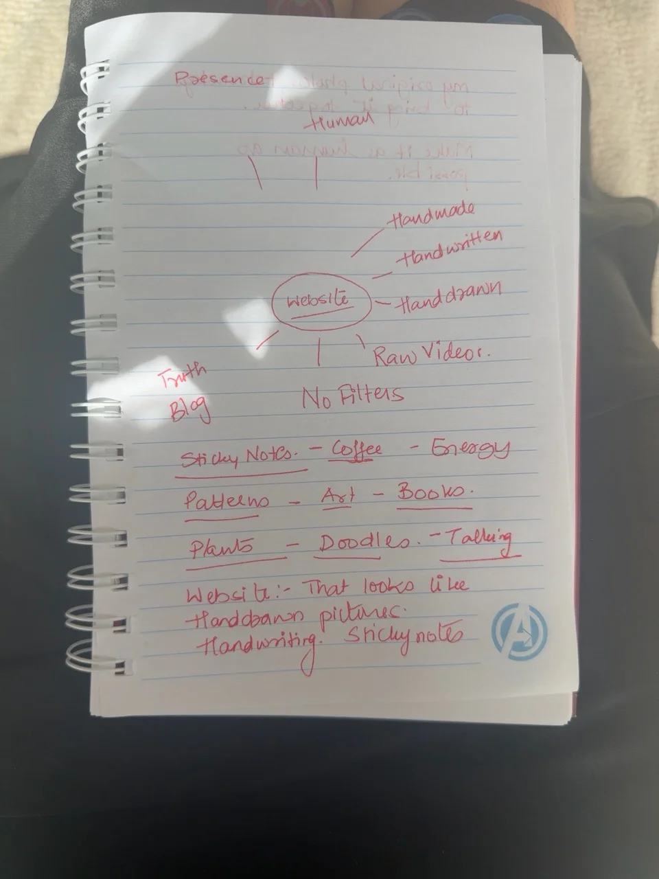 The actual brief for this website, in red pen.
There’s a circle around “website” on this page. Off to one side I wrote “handmade”, “handwritten” and “hand drawn”. Three versions of almost the same thought, all in red pen. Looking at the page now, that repetition tells me more about what I wanted than a list of website features would have.
Take the tree on the front. It’s a photograph I already had. The drawing starts where the photograph finishes, so your eye can follow it off the edge and onto the paper. That small join was one of the details I kept coming back to.
On the back, there’s room for a note you can actually read. A short paragraph, a bit of space and my name at the bottom. When I’m deciding whether to add something else to this site, I can come back to that page and ask whether it belongs on the same postcard.
Pallak
Back to the work folder